Sabra is one of the nation’s biggest mass manufacturers of hummus, and their products are sold in stores all across the country. Though their products, which are available in numerous different flavors, are highly successful, consumers had some complaints about the packaging. Sabra’s experience is an interesting one, but it’s one that other food product manufacturers should consider, as well.
Who Is Sabra?
Sabra is a relatively new company that only emerged in the last 10 years. The company capitalized on Americans’ newfound love of hummus, a delicious dip made from chickpeas and various seasonings. Though Sabra also manufactures other products, including tzatzikis with a Greek yogurt base and guacamole, hummus is its bread-and-butter, and they control about 60% of the total hummus market share in the United States.
The Updated Packaging
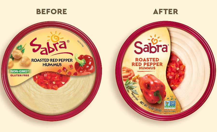
Sabra recently unveiled its new packaging design that is very similar to the original, which has led many people to wonder why they changed the packaging at all. The new packaging shows Sabra’s new, updated logo, a complete restyling of its label, and photography that shows the ingredients used in the various hummus products. The reasons why Sabra chose to update its packaging are quite surprising, but the company’s CEO, Eugenio Perrier, gave some insight.
Per Perrier, the company believed that while Sabra’s original hummus packaging was still serving the company well, it was time to update the packaging to better represent the brand’s mission and attributes. They believe that the new packaging helps to enhance the customers’ flavor expectations, all while conveying the Sabra brand’s personality and promise to use only fresh, delicious ingredients in its hummus.
Simple Changes for a Bold Effect
Some of Sabra’s original designed elements remained – namely the red rim and the clear window allowing consumers to view the actual product inside. The red rim became a mainstay that helped customers identify Sabra hummus, and the company wanted to continue that trend moving forward. The clear window serves much the same purpose; it exists to allow buyers to see the texture of the hummus and the colors of the fresh ingredients, which helps to drive interest in the product by setting certain expectations in terms of flavor.
The Sabra “sun” icon, which appears just over the word “Sabra” and is part of the company’s logo, was redesigned to represent the shape of a chickpea with sesame-seed shaped rays of light. The company felt this was a better representation of the product as a whole and would drive more consumer interest. Sabra has successfully conveyed its Mediterranean heritage, and so far, consumers are very pleased with the new packaging.
Sabra’s success and recent packaging redesign shows just how important even very subtle packaging enhancements can be, especially when it comes to portraying a brand’s heritage, mission, and dedication to quality. It just goes to show that companies in the food industry truly need to think about the best ways to set customer expectations and accurately represent their foods with external packaging.
Image Source: Sabra

